Sections
The nineteenth century, with its public domain materials, has offered so much to text mining, quantitative analysis, and “distant reading” at large scales. How might its masses of published visual materials invite a similar kind of scrutiny? What kinds of historical questions might answer to image processing techniques? How might computer vision reframe or challenge our inquiry into the cultural past? To date, our research has been exploratory, testing the feasibility of computer vision for analyzing large collections of nineteenth-century periodical illustrations. Our goal has been to develop technical workflows as well as to identify promising avenues of cultural historical inquiry. The samples below suggest some of the approaches we have taken.
Semantic analysis and the lineated image
Wood-engraved illustrations made possible the conditions of mass viewing which contemporary analytics techniques arise to investigate. The problem is, these illustrations tend to defy the very tools that have been made for processing images en masse. Many out-of-the-box algorithms for computer vision are trained to work on photographic data; they cannot reliably handle the lineation and hatched tonalities of wood-engraving. Furthermore, their very visual ontologies are trained on photographic viewpoints which the subtle complexities of wood engraving do not observe. Victorian periodical artists and engravers were afforded a “view from nowhere” and varied compositional strategies and a spectrum of varying detail. All of these factors present challenges to computer vision techniques, particularly which aim for image segmentation, classification, and semantic analysis--that is, approaches which recognize something based on an existing or trained understanding of what it is.
Face detection
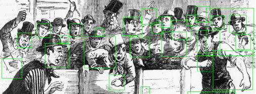
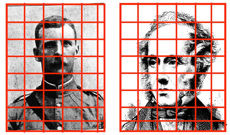
Open-source face detections algorithms, including those in the OpenCV image processing library, immediately have trouble with the wood-engraved image. In the example above, the sketch artist and/or engraver renders faces in several different ways, from simplified background faces to outright caricatures. Faces appear at different sizes relative to the engraved line. Cross-hatching and lines are used to create shading, as in the following example:
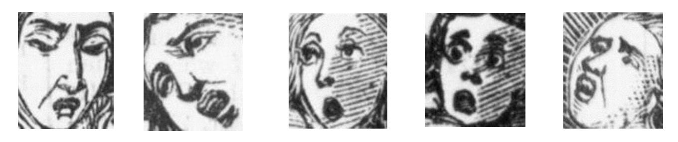
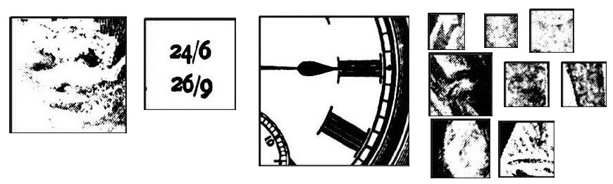
Though the economy of line renders a face quite clearly to a human viewer, image processing algorithms can identify all sorts of areas in nineteenth-century illustrations as faces. Detection errors can also result from poor scans of newspapers as well as curious arrangements of other symbols or glyphs. “Falso positives” or image sections wrongly identified as faces include images like this:
Training an algorithm on higher-quality images from our data set produces slightly better results, particularly when using halftone images – though it also raises important questions about the assumptions of such a search (as discussed below). We initially hoped to apply face recognition to the data set, tracking the appearance and recurrence of famous figures in the news, or perhaps the patterns of facial individuation in nineteenth-century illustration. This seems less feasible than applications for face detection or object detection (such as top hats), including measuring the “population” of images in the news, similar to crowd-counting algorithms used today.

Machine learning
 Seeking other approaches to semantic analysis, or classifying an image based on its content, we began experiments with machine learning, starting with the open-source software Caffe, a deep learning framework. When Caffe is presented with a relatively clear and simple picture, it can accurately classify image content, as in the image of the pitcher on the right.
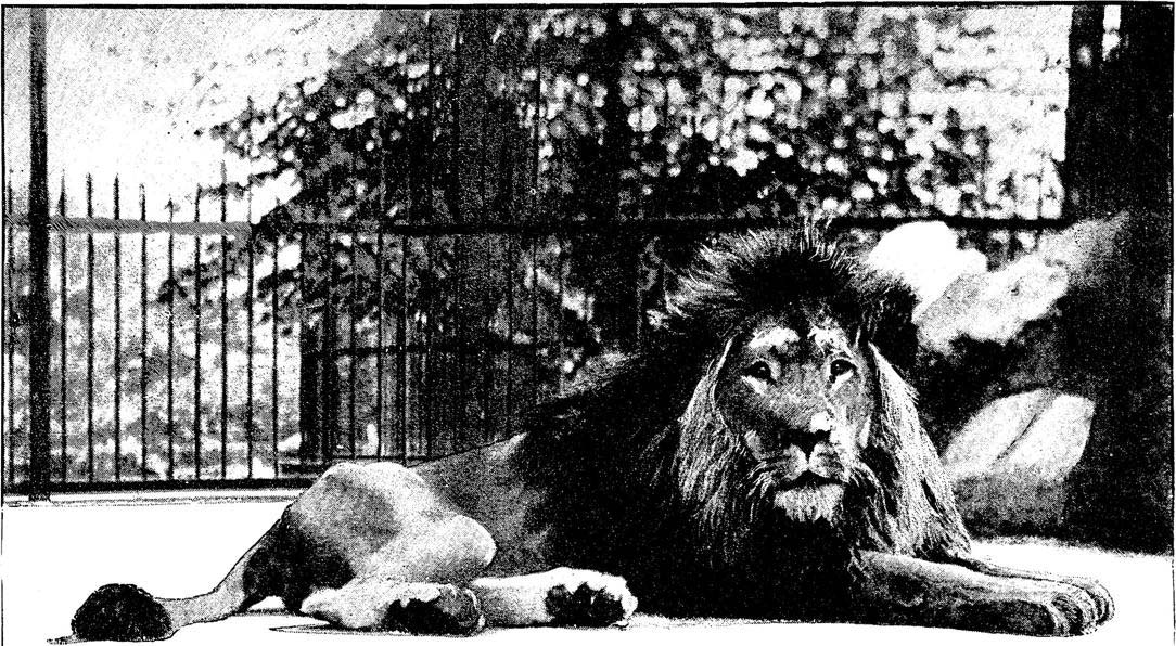
However, Caffe struggles with even slightly more complex illustrations, thrown off sometimes by the hatchwork of engraved lines which it misreads, as in the next example, as “chainmail”; or confused by the hazier 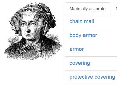 reproductions of nineteenth-century reprographic media, as in the next example: a halftone portrait it bafflingly understands as “placental” and “primate.”
To function more effectively, deep learning algorithms might be trained on a tagged data set, “taught” to identify positive and negative examples. That might be possible only within the constraints of a given image-making technique. We are currently looking for sets of tagged training 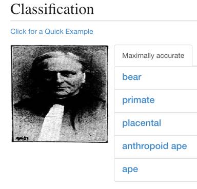 data with which to further experiment with image classification. But as with the visual complexities of parsing facial information, the immediate failure of machine learning frameworks suggests the incredible variety of style and visual information which a periodical viewer would synthesize. It likewise raises the question of anachronism: classifying images is a tool for us, but how would a Victorian viewer identify genres of images? Can historians even model the cognitive affiliations of images and meaning that, given the scale of the periodical press and the demographic diversity of its readership, seem almost unimaginably difficult to theorize or reconstruct?
Pixel-level processing
Pixel-level processing may offer a way around the interpretive biases of semantic classification. In pixel-level processing, you do not ask the computer to understand something about the image, but merely to take measurements at a rudimentary level: image pixels. Computers are good at brute force measurement; humans are good at visual synthesis and interpretation, at negotiating multiple and complex modalities of representation. Pivoting from semantic analysis to pixel-level analysis, we used two primary measurements for image processing: pixel ratio and entropy levels.
![]()
The formula and examples for pixel ratio appear above. In the simplest terms, pixel ratio measures the relative amounts of lights and darks in an image. We used MATLAB to process all of the extracted images for each illustrated newspaper and generate sorted lists of images as well as distribution charts. We ran similar process to identify entropy levels in individual images and in newspapers over time. The formula and examples of entropy level are:

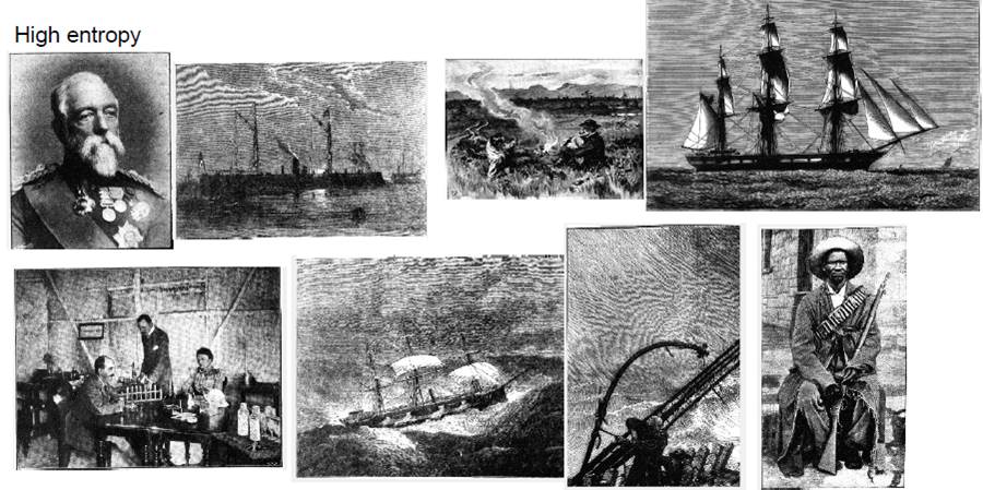
As a concept in information science, “entropy” is a measure of how much information something contains. This is to understand “information” less as stuff to know, more as a range of possible signals. The greater the range of signals in an image -- in this case, pixel areas from light to dark -- the greater the entropy measure. An image that only uses a limited range of pixels has low entropy; these usually look very light or very dark. An image saturated with a broad range of pixel values has high entropy, as in the examples following. These images usually yield the more complex representations in the data set as well as capture many halftone images.
Meaurements of pixel ratio or entropy level are not especially illuminating about any single image. However, they are useful tools for sorting lots of images based on informational similarities. They may also offer a picture of a periodical’s visual functions at a distance, as in the following scatterplot of the Illustrated Police News, overlaid with representative images from the data set.
![]()
At such a view, human interpreters can start to see and speculate about meaningful clusters of images, zooming in, as it were, on semantic features and further questions they provoke. Lev Manovich has done similar work in visualizing media collections, trying to build tools and workflows for a “distant seeing” to match the “distant reading” techniques developed for text analysis. In this chart, we noticed that low pixel ratio, low entropy images tended to capture the tabular information and display advertisements in the Illustrated Police News.
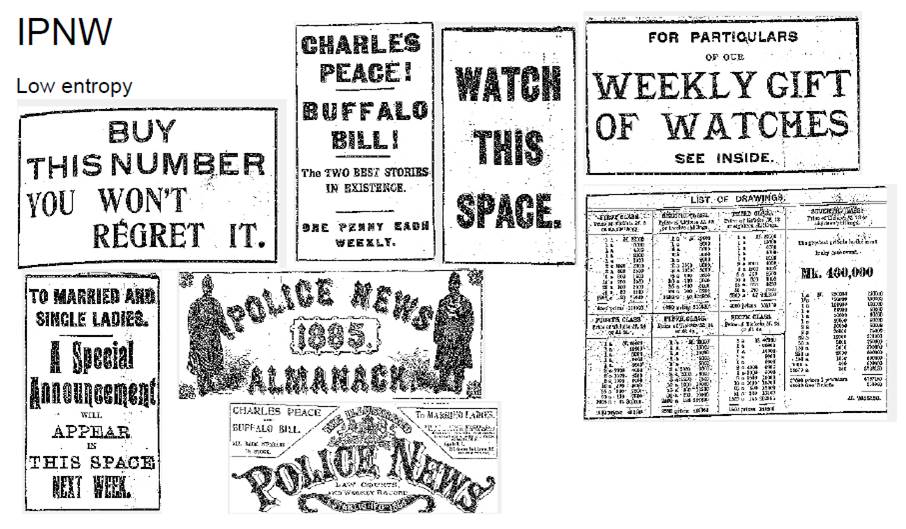 In effect, sorting by entropy levels works like nineteenth-century ad blocking software. This kind of processing also raises questions for the scholar about the very thresholds of text and image, or the transformations of typography and graphic design to capture visual attention on the page. Other kinds of provocative clusterings emerge from elsewhere in the Illustrated Police News’s distribution. For example, high-pixel ratio images tend to capture lots of depictions of night scenes:

By visualizing a collection of illustrations, sorted by a very simple metric, we are asked to reckon with more complicated questions, including techniques of vision and surveillance in the Illustrated Police News, how these intersect with the genres of sensation in the nineteenth century, or even the cultural history of darkness. Computational techniques in the humanities do not answer these questions; rather, the help expose questions for the researcher to pursue with a fuller range of historical methodologies.
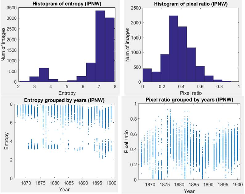
At an even greater remove, we can chart these visual parameters for an illustrated newspaper over time, looking for patterns and deviations, considering the possible ways the data might encourage or mislead further inquiry. In a way, the timeline offers a view of the dynamics of constancy and change in the illustrated newspaper, or the dynamics of seriality and miscellaneity that the scholar James Mussell finds at the heart of the Victorian periodical.
Halftone identification
The last two decades of the 1800s saw wood engraving cede to halftone photoprocesses in the printing of illustrations in newspapers and periodicals. (For details on the halftone process, see Stulik.) As our data set stretches through that transitional era, we adapted the work of Yun-Fu Liu, Jing-Ming Guo, and Jiann-Der Lee in using image processing algorithms to identify and separate halftones from wood-engraved illustrations. This technique begins by splitting up images into discrete patches:
These patches are evaluated against a set of threshold values to identify “good” patches for measuring. The resulting good patches are then tested again against a set of thresholds defined for halftone vs. non-halftone illustration:

On its own, the human eye does not need much help distinguishing between a halftone and a wood engraving. Like measurements of pixel ratios and entropy, this process is more useful on a larger scale, allowing us to measure and sort by production type, as well as to look at large-scale changes in illustration methods over time. For example, we ran the test against all the extracted images from our run of The Graphic, charting the relative numbers of images algorithmically identified as halftone vs. non-halftone:

While the chart shows a few errors, it usefully tracks the periodical’s steady reprographic shift to halftone processes at the century’s close, to the point where halftone images were produced equally with wood engravings by about 1900. In addition to suggesting broad patterns, the chart also signals the reseacher to investigate its anomalies, including the spikes which often relate to special supplements to The Graphic, as well as what the algorithm suggests may be the first time The Graphic published images with the halftone process.
In the 5 September 1885 issue appears an article by Phil Robinson called “An Amateur Photographer at the Zoo” with halftones made from “instantaneous photographs” by C.J. Hinxman. Though The Graphic was not the first periodical to use halftone photoprocess, this particular instance raises interesting questions about photography and middle-class leisure, animals and the photographic subject, and the sources and manipulation of published visual content in the illustrated press.
Halftone detection also underscores that not all halftones derived from photographs. The halftone process could be used to print images made in other mediums, including lithography, as in the following example.
Offprint lithography would come to dominate commercial printing in the twentieth century, allowing the reproduction of diverse modalities of text and image. But halftone allowed a new range of reprographic reproduction too, photography most famously, though also including image-making techniques in a range of mediums beyond the wood-engraved illustration. It may be possible to further train image processing algorithms to identify and sort based on these other parameters.
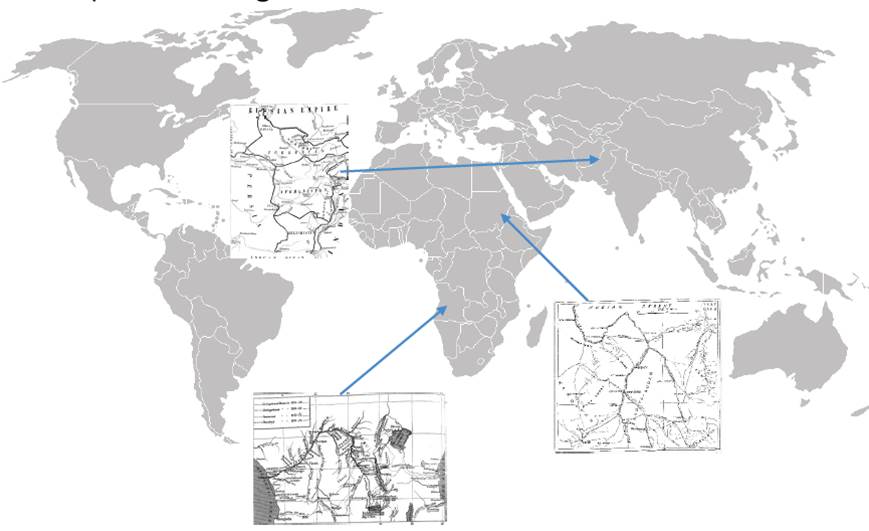
Discovering maps
Another example of how low-level measurement and sorting can lead to higher-order interpretive questions. On the other end of visual complexity from halftones in The Graphic are the low pixel-ratio illustrations which, when collected together, show the presence of maps:
![]()
As primarily line diagrams, maps have far more lights than darks on the level of pixels. But the researcher’s curiosity is drawn further to investigate why The Graphic was printing maps, or how common this was as a feature of illustrated periodicals more generally. These particular maps suggest what thresholds of geographical understanding The Graphic might presume in its readers, or the extent to which graphic knowledge was part of an imperial imagination.
Portraits, faces, and races
In the broad sweep of higher entropy but mid-pixel-ratio images in The Graphic, you find a lot of faces, detected not by an algorithm but by their visual consistency within a sorted set of images. The periodical featured hundreds of portraits in oval vignettes, some engraved, others from photographs. Nearly all of them depict well-dressed white men.
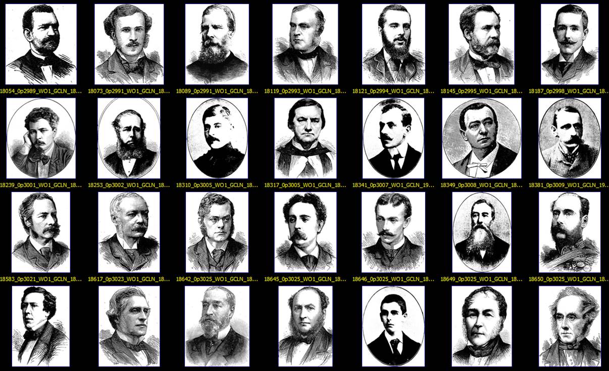
On the surface, this is hardly a revelation, considering the dynamics of race, class, and gender which prevailed in Victorian England and which were managed – and even consolidated – by representational outlets like The Graphic. But, collected together, the almost endless gallery of whiteness arrives with the shock of its homogeneity, what goes unseen for being always seen, always on the surface. The gallery contrasts with all the faces which are not there, including all of what The Graphic chooses not to represent in keeping with the biases of its day. But also those faces which are absent from the data set, missing from the archive as digitized by the British Library and commercial vendors, collected for investigation by researchers.
 We also have to ask what remains invisible to computer vision because of biases encoded within it. Scholars and photographers have exposed the racial bias in the normalization of color film in the twentieth century. Digital imaging and image processing algorithms, in some ways, may recapitulate a kind of blindness to faces of color reaching back through photography to white-line engraving, representing darkness as so many cuts on the surface of wood.
Computational vision techniques and image processing remain a promising field in which historical researchers can explore and interrogate the visual record of the past. In so doing, it is imperative that researchers also identify the blind spots, whether as false negatives in the results, absences from digital collections, and the biases within any method of cultural research, computational or not.